When planning connectivity deployments in emerging markets, it’s important to have a clear picture of where existing power lines are placed. This information helps us make better decisions about where to focus our efforts, how we design the network, and how we source the equipment we’ll need. When we look for this information in developing countries, however, it is often outdated, inaccurate, or too low resolution to be useful. To find a more accurate picture using existing resources, we partnered with the Energy Sector Management Assistance Program (ESMAP) at the World Bank, KTH Royal Institute of Technology, World Resources Institute (WRI), and the University of Massachusetts Amherst. Together, we developed a new predictive model for mapping medium-voltage (MV) infrastructure using publicly available data sets. Today, we are releasing the output of this model for six countries through the World Bank’s open energy data repository. We are also sharing detailed documentation for replicating the model, and a segment of code developed specifically for this application. To the best of our knowledge, this is the most accurate globally scalable product of its kind.
Developing the model
As we worked through our solution and began discussing it with our partners, several of them expressed interest and noted that this model could be helpful beyond just our initial purpose. For example, local governments, businesses, and nonprofits can use it to understand where people need electricity or where to expand water pumping infrastructure to provide basic services. Our partners were valuable in ensuring that this work could address the needs of a diverse community. The ESMAP team at the World Bank, energy experts from KTH and WRI, and professor Jay Taneja at UMass provided important support, including ground truth data; data validation; and feedback on model design, development, and performance. Thanks to this collaboration, we now have a model that generates grid paths within one kilometer of known grid locations about 70 percent of the time based only on publicly available data. Accuracy can be further improved through the addition of more locally relevant data.
We initially tried a computer vision approach to detecting MV infrastructure, using high-resolution satellite imagery collected during the day. But there were significant challenges with this method. For one, the shape and orientation of poles and structures are so diverse in form that even large image training sets were insufficient to generate high-quality labeled examples. In addition, vegetation, shadows, and nearby similar infrastructure made it hard to correctly identify MV grid lines. We decided to instead try a predictive modeling approach, using indicators of electrification.
Locating settlement-level electrification
In order to achieve our goal, we needed to first find signs of electrification. The most reliable and publicly available global indicator of electrification is nighttime radiance, which is collected by the VIIRS day-night band sensor on the SUOMI-NPP satellite. Using these night lights, we can see which communities regularly generate enough light to be detected from space. Images are collected at about 2 a.m. local time, which means they are dominated by all-night outdoor lighting. By using night lights to infer electrification, we make two assumptions: First, all settlements that generate detectable lighting are on the grid, and, second, all settlements that do not are off the grid. We recognize that these assumptions can drive some false negative or false positive predictions. However, we believe these can be addressed by using more local data at the country level, such as the Nigeria Millennium Development Goals Information System’s (NIMS) education facility data, which lists the electrification status for all schools in Nigeria.
Human-generated lighting is just one source of nighttime radiance. In order to make use of the images, they first had to be corrected for natural light sources, such as reflected starlight and moonlight, clouds, wildfires, and lightning. Indirect and non-settlement sources of light, including oil well flares, fishing boats, bonfires, and reflected city lights, needed to be removed as well. To remove these, we worked with a sequence of monthly composite images covering a period of five years (2012 to 2016). NASA compiles an image each month, combining the most cloud-free, moonless images to cover the earth. We applied a custom image processing filter to each image to remove the background and reflected light and to identify pixels that are significantly brighter than those in their immediate neighborhood. Then we found which pixels were consistently lit over time, eliminating light sources that were temporary or mobile. The points that remained were assumed to be settlements with a connection to grid infrastructure, in the form of an MV distribution line.
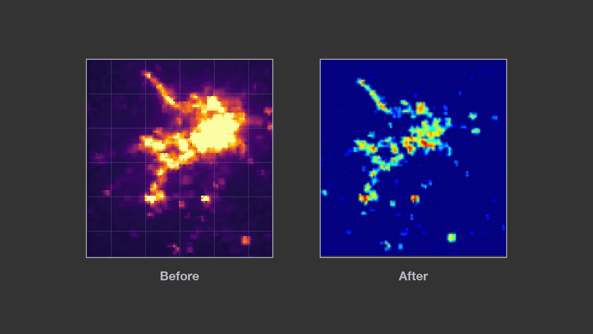
Left: Composite image before filtering for nightlights. Right: Composite image after filtering out nightlights, showing settlement level electrification
Following the electrical grid
Once we identified electrified settlements, we needed to find the lines that connected them. The grid estimation algorithm (a modified version of Dijkstra’s shortest path; shared here) seeks to make connections in the most efficient way possible. Using known electrical grids as templates (based on data available from energydata.info), grid paths are encouraged to follow roads, avoid water, and prefer shorter paths. Modifications that result in more accurate grid paths can easily be incorporated into the method. We experimented with adding terrain elevation and slope as features and tried adding in railways as preferred grid paths, but we didn’t find any significant benefit in our testing.
 Animation shows how the algorithm predicts grid paths.
There are a couple of instances where the algorithm’s predictions didn’t match up with actual grid locations. The most common inaccuracy occurs when the model selects the wrong path for a power line out of two equally reasonable options. Larger deviations can occur when electrified settlements aren’t detected, which can happen when power lines are present but no longer carry electricity, or when settlements consist of just a few buildings or are obscured by trees. Particularly in rural areas, this can lead to the model’s omission of entire branches of the grid. Lastly, the model occasionally finds power lines extending to settlements that are not included in on-the-ground measurements. These may be mistakes, or they may reflect newly established grid extensions that don’t yet appear in official maps.
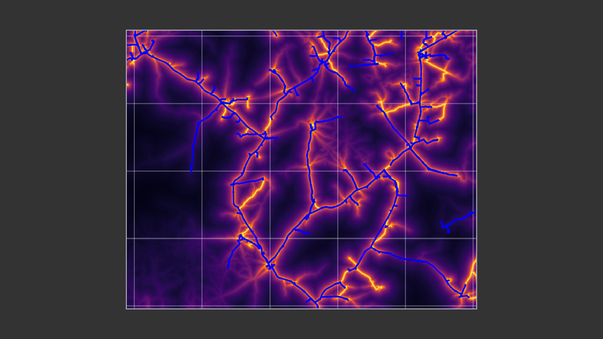 Results of the predictive model: The bright orange lines show where the model predicted the grid lines would be; the blue lines show the ground truth data for comparison to see how accurate the model was.
Output
To make it as convenient as possible, the output for each country is shared in two formats: a comma-separated values (CSV) file and a geotiff. The CSV has rows giving the latitude and longitude of each point along the grid at about 40-meter intervals. The geotiff contains all the same information on grid locations but in a format that can easily be imported into geographic information systems software for visualization and comparison with other mapped elements, such as roads, political boundaries, and population centers.
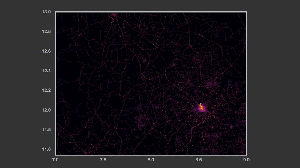
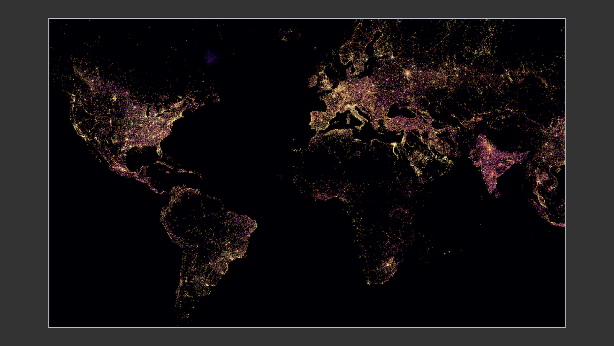 Sample results showing global settlement-level electrification
Because we believe this data has the potential to drive positive outcomes for many sectors, we are sharing a tutorial that outlines the steps required to replicate the model using the same original public data sets. Additionally, the segment of code for the modified version of Dijkstra’s shortest path can be found here.
We hope the global community will build on this work to develop more accurate results for more countries. We look forward to seeing the future evolution of this work, and encourage the community to keep the work open by sharing model results on energydata.info or similar platforms.
We would like to thank Sedar Sahin and Waqar Malik for their work on this project.


")